Sue Liebow Memorial Trophy 2018
Results

Judged by Tony Byram
I bought my first camera almost exactly 60 years ago and spent the next few(?) years doing the usual youngster things - occasionally taking some pictures of friends, family and holidays - not necessarily in that order though.
I finally started to get my act together photographically in 1987 after I returned from a stint working in Canada and joined a Camera Club - Hanham Photographic Society - where I settled in for a number of years.
I found I enjoyed this new way of looking at pictures and soon started to expand beyond the Club. A couple of years later I gained my LRPS, going on the become the Exhibition Secretary for the WCPF and after about 6 years progressed to be President of the WCPF in time for the 'New' Millenium.
Photographically I am a bit of a 'generalist' not having any real preference for any subject matter, which I enjoy as going for my 'letters' meant I had a good range of images to use. It also means that I enjoy looking at a wide range of subjects when judging.
I suppose, though, that nowadays my main 2 subject areas these days are Venice Carnival, along with the various figures, and Canal Boats as Jenny and I have Time Share on a canal.
First: Spider Woman by Alan Grynyer
|
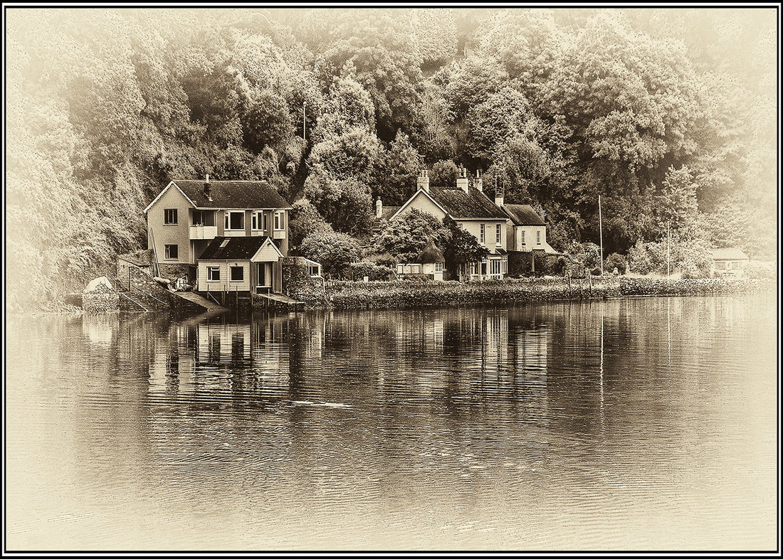
Second: Tranquility - River Dart by Eileen Scantlebury
|
A very traditional-looking image which I think works well.
I like the reverse vignette on this image as it forces the viewer to look at the houses and trees which are more central to the picture. The monochrome treatment gives an 'olde worlde' feel although the houses really look quite modern in reality – an interesting contrast which works well. Contrast and exposure are good, giving just enough 'punch' to the image |
Third: Loy Krathong Float through Mirror by Paul Kessler
|
Commended: Titbit by Jaan Maivel
|
The owl is very well placed in the frame, with just about enough clearance on each side.
This does not qualify as a 'real' Nature shot as the table is obviously “evidence of man” - and the title certainly removes any expectation of a Nature shot. As a pictorial image, though. I think it works very well. The owl itself is beautifully sharp and well lit. The 'titbit' of the title is somewhat small in the frame, so maybe a more suitable title would work here. Unfortunately there are a couple of minor faults in the bottom part of the picture – to the left of the post supporting the 'table' there is a bit of what appears to be a fence, coming from the point where the 'table' and its support meet there is a line coming down diagonally to the right and on the right-hand side about halfway vetween the bottom and the owl's wing there is a piece of fence or road showing. These all needed to be cloned out. |
Commended: Short Eared Owl by Mike Smith
|
Beautifully captured in flight with no real distractions.
A bit of 'letter-boxing' by removing the grasses and distractions at the bottom of the picture might have made this a slightly stronger image – and the owl would still be well-placed in the frame. The owl here has been beautifully captured with good lighting and pin sharp, especially on the face. Placing the owl on the divide between the green of the land and the pale blue of the sky helps to strengthen this image. |
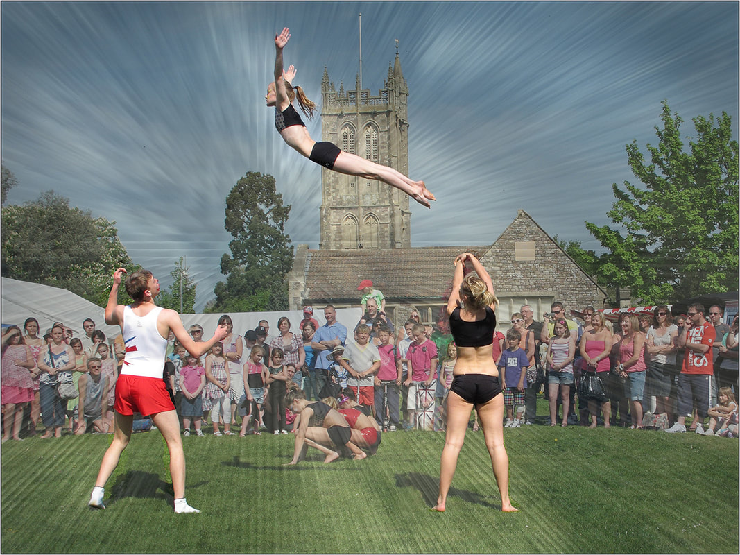
Flying Through the Air by Betty Billingham
|
An interesting idea which has almost come off.
The 'flying' figure (as in the title) is beautifully caught in mid-flight, balanced between the male and female figures below forming a classic triangle. I am, however, not too sure if the 'starburst' actually adds to the picture, especially as it has missed in a couple of places. The male figure to the left has a large area to the right of his left leg which was untouched by the starburst effect, and the female to the right has 2 smaller areas – one under her left foot, the other to the right of her right leg – which got either missed or erased. There is also a 'funny effect' (? cloning) to her right where the woman with the red-and -white stripey top has lost her head. |
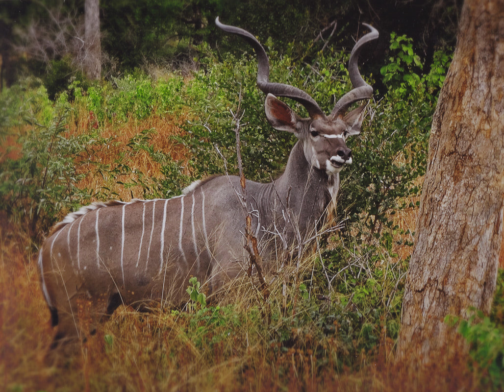
Waiting by ???
|
The first impression when seeing this picture was that the colour is far too strong, which is a pity as the (anonymous) animal is really well captured.
This could well do with some judicious use of 'colour and saturation' to help the viewer. It could well be that this is an accurate rendition of what was in front of the camera – but, to be honest, it is a bit overwhelming when projected in isolation. Most of this is nice and sharp, so it is disappointing that the very strong colour is what is dominant not the quality of the images itself. The first impression when seeing this picture was that the colour is far too strong, which is a pity as the (anonymous) animal is really well captured. This could well do with some judicious use of 'colour and saturation' to help the viewer. It could well be that this is an accurate rendition of what was in front of the camera – but, to be honest, it is a bit overwhelming when projected in isolation. Most of this is nice and sharp, so it is disappointing that the very strong colour is what is dominant not the quality of the images itself. |
Animal by Erica Harrison
|
Click here If you wish to show off your best images (especially when taking Nature shots) then it would help you to make an extra effort and find out either what type of animal it is or what its name is. Unfortunately here there is no information and so we have to rely on the pictorial elements in the picture to make an assessment.
Pictorially there are a couple of problems with this image. The first is that it is not really pin-sharp and the second is that there is a lot of 'rubbish' between your camera and the animal so we cannot see it clearly. This is really a pity as the animal is well-placed in the frame and would appear to be 'doing something' ie eating, so these are positive points. You did not photograph an animal standing in the 'wrong' place, this one is in its natural environment which is good. The use of the tree on the right for framing also works well and acts as a natural 'stop' to the eye. As the lighting was a little flat when you took the picture a little bit of 'fiddling' (with photoshop or whatever (I actually use Paint Shop Pro) could be used to improved the light and get a brighter picture. to edit. |
VW at the Beach by Maggs Henson-Edwards
|
An interesting 'montage' whether it was done pre-camera with models or in your computer doesn't really matter, what you have produced is a little fun cameo.
The different scale of the VW and the background (boat, planks, whatever) adds to the incongruity of it all. I think the 'flower power' aspects of the VW help. Pin sharp and well-lit this is a fun picture' |
Loy Krathong by Paul Kessler
|
Although still a 'Festival of Light' picture this one is very different from the one we will see later.
There is an inevitable problem when trying to photograph bright flames in a darkened area and I think this has been reasonably well handled here. The hands emerging from the lower left corner of the picture work well. We are led into and across the image as far as the flames which act as a natural stop. Working in low light is always a problem in some areas – either for focussing (you or the camera) and probably pixellation. Although not completely avoided here these have been minimised. It's possible that with some work in the computer you could have lowered the contrast between the flame and the background, but I'm not sure if this would really help. |
Mother Bear and Cub by Peter Range
|
A real “aaah!” picture with the Cub placed about 2/3 of the way across the frame, especially as it could well be looking at us.
This image has been well letterboxed, concentrating all our attention on the central band of the picture. The Cub and the background appear to be sharper than the adult bear. The placing of the adult bear against the darker band of wood to the left and the dark-furred cub against the lighter stones and wood gives a strength to this picture. I feel that the out-of-focus water in the foreground does, however, weaken this image slightly. |
Lakeside by Yvonne Moore
|
A nicely rendered landscape showing what I think is a “noxious weed” - at least it is on the South Island of New Zealand. Certainly this looks like NZ – if I'm wrong then it actually makes no difference to my comments!
I think that there is a tad too much sky in this image. Cropping it about halfway between the mountains and the top of the picture makes, I think a stronger picture with the emphasis on the near shore with the lupins and the far shore with the trees, bushes and snow. Technically the lower clouds look a little overexposed and the right-hand mountain is a bit 'edgy'. A well-seen and overall well-lit landscape. |
Trainee Bhudist Perhaps by Chris Taylor
|
An interesting and different portrait which has some strong points but also some weaker ones.
The main weak point is the dark background on the upper left-hand side. Unfortunately as a result we cannot clearly see the back of the young lady's head or her neck and she 'fades' into the background, her face and hands however are very clearly separated from the background. From my own experience I am not sure that Trainee Buddhists have rings, studs or piercings, nor, perhaps, such well-manicured nails! As a portrait I think it works quite well. The lighting is good and the model well-placed in the frame. |
Girl with Water by Betty Billingham
|
As a montage I think this is an interesting shot.
The very narrow reverse vignetting around the image does help, as it keeps your eye concentrating on the more central elements of the picture. The statue is a little pixellated, which is OK here, and I like the way the added spiral of colour is entwined with the figure. Using the lower part of the spiral to 'mask' the legs of the figure works very well. I would, however, prefer to see the water from the jug fading out before it reached the edge of the frame. |
Western Art Meets Photoshop by Eileen Scantlebury
|
This is a good attempt at something a little different. The mixture of reality and graffiti makes a
good contrast, but I am not sure that it quite comes off.
I also feel that a small trim down the right-hand side to remove the wall would balance up the picture up. The lighting on the 'live' model is very gentle, with no harsh shadows and I think that this works well and she is well-placed between the 2 graffiti faces. |
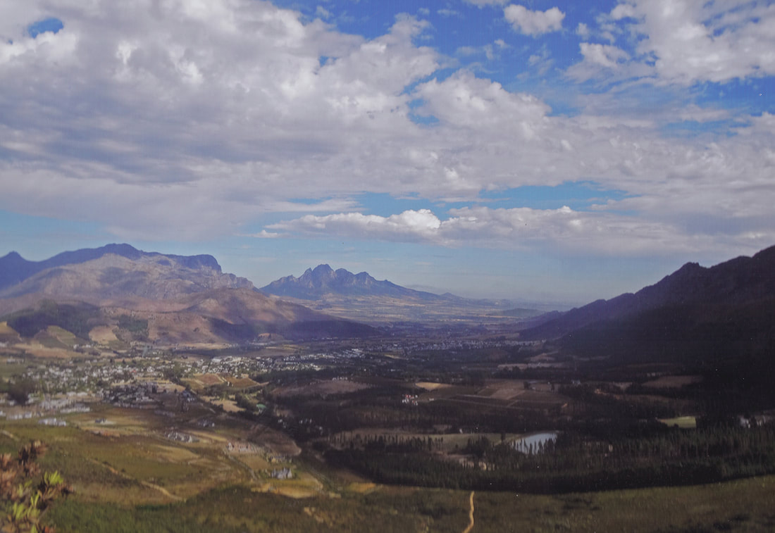
Landscape by Erica Harrison
|
I imagine that this image started life as a fairly low-resolution image, which has not done it any favours.
Compositionally it works very well - there is a good lead-in across the trees and lake on the right into the valley. The light areas on the left nicely encircle these. The exposure is spot-on, with perhaps the loss of detail of the mountains on the mid right. In fact for detail. The clouds - tricky at best to get right – give a good depth. However at the resolution needed for a competition the original image really does not seem to have enough pixels to give a good quality, sharp image. |
Up and Away by Jaan Maivel
|
A nice, bright, clear shot of someone having a good time with a typical English background (and even if it's not it looks like is).
I know the title implies that this guy is taking off, but to me his position looks more like he's landing – and what a pity he did so right next to another canopy or bag which is just the wrong colour to blend into the foreground. Compositionally I like the shadow below the guy with the 'chute – it seems to make a connection between him and the ground. Good lighting and pin sharp. |
Tyntesfield by Maggs Henson-Edwards
|
I found that I kept wanting to straighten this picture as it leans slightly to the right.
The top edges of the building at the end of the path, and indeed most of the buildings and trees, are very 'edgy' with a white line along them. You picked a good day and good time for lighting – or maybe you were just lucky – as the strong side lighting really pulls out the detail in the building. You have handled the lighting very well, except perhaps where the clouds over the building on the right are concerned. There are no burnt-out highlights and no deep shadows. From a composition point of view I think that if you had stood on the right of the path - rather than being central – this would have been a stronger image. As it is there is no 'depth to the building. |
Goldfinch by Mike Smith
|
The face and breast feathers of this bird are pin sharp – however a smaller aperture than f5.7 – say f11 – would have given a greater Depth of Field and the resultant shutter speed should have been enough to keep the bird sharp. As it is the back of the wing and the tail feathers are not sharp which is a pity as otherwise this is a great shot.
The bird is well-lit as is the thistle which is also nice and sharp. You did well here to get the contrast right so that both the thistle and the snow are well exposed. |
In memory of Men and Women Killed in Action by Peter Range
|
At first glance this is a very strong image – but on a second look there is one major weakness, the 'sitting' figure on the right.
Adding extra space to the right would give room to see the memorial more clearly. As a monochrome this image works very well, it has impact and emotion and I do not think that to have this picture in colour would make it any stronger. Other than the problems outlined above I think that all the elements in this picture work very well. |
Robin by Yvonne Moore
|
A lovely shot of a 'one-legged Robin' in an interesting setting.
The light background means that the darker bird stands out well from the background. Generally the colours look right, but the 'Red Breast' looks a little muted. All the feathers on the Robin are sharp and stand out well, and because the background is a little soft there is a nice 3D effect on the bird itself. |


